 |
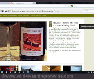
| Magazine Dynamic View Test. |
I tested out the Dynamic view layout on my blog yesterday and today. It did not take long to receive negative feedback.
While I liked the look of the "Magazine" Dynamic view, it was not iPad or tablet friendly. The experiment is over, I have switched back to my more traditional layout. It is more or less the same as it was. At least the trial run forced me to adjust my content and fix some typos. I also added a new page "Top 10 Under $20" which has a list of my current favorite wines for less than $20 a bottle.
Someday things may sort out with Dynamic Views. Cheers!